SNU SMILECENTER
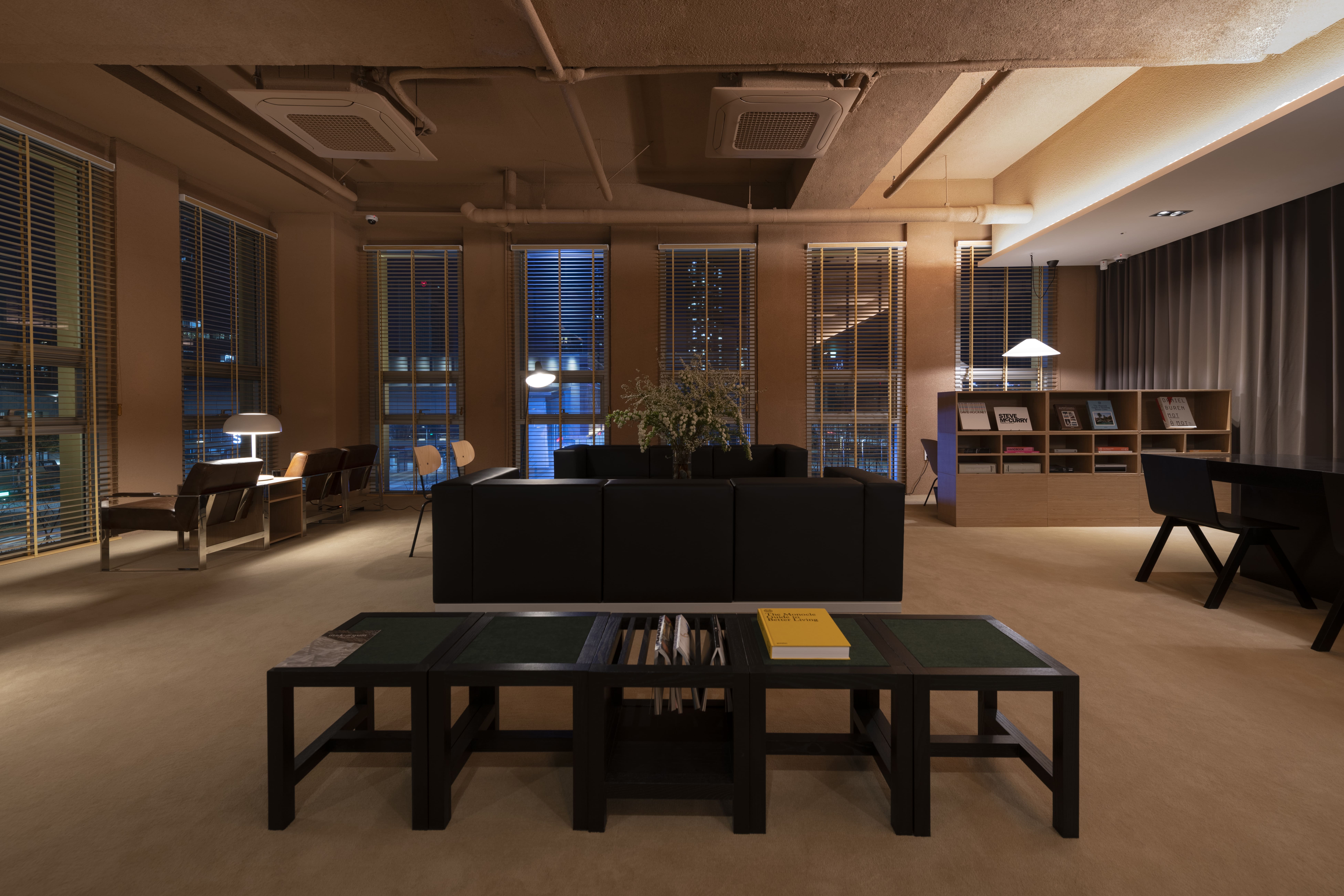
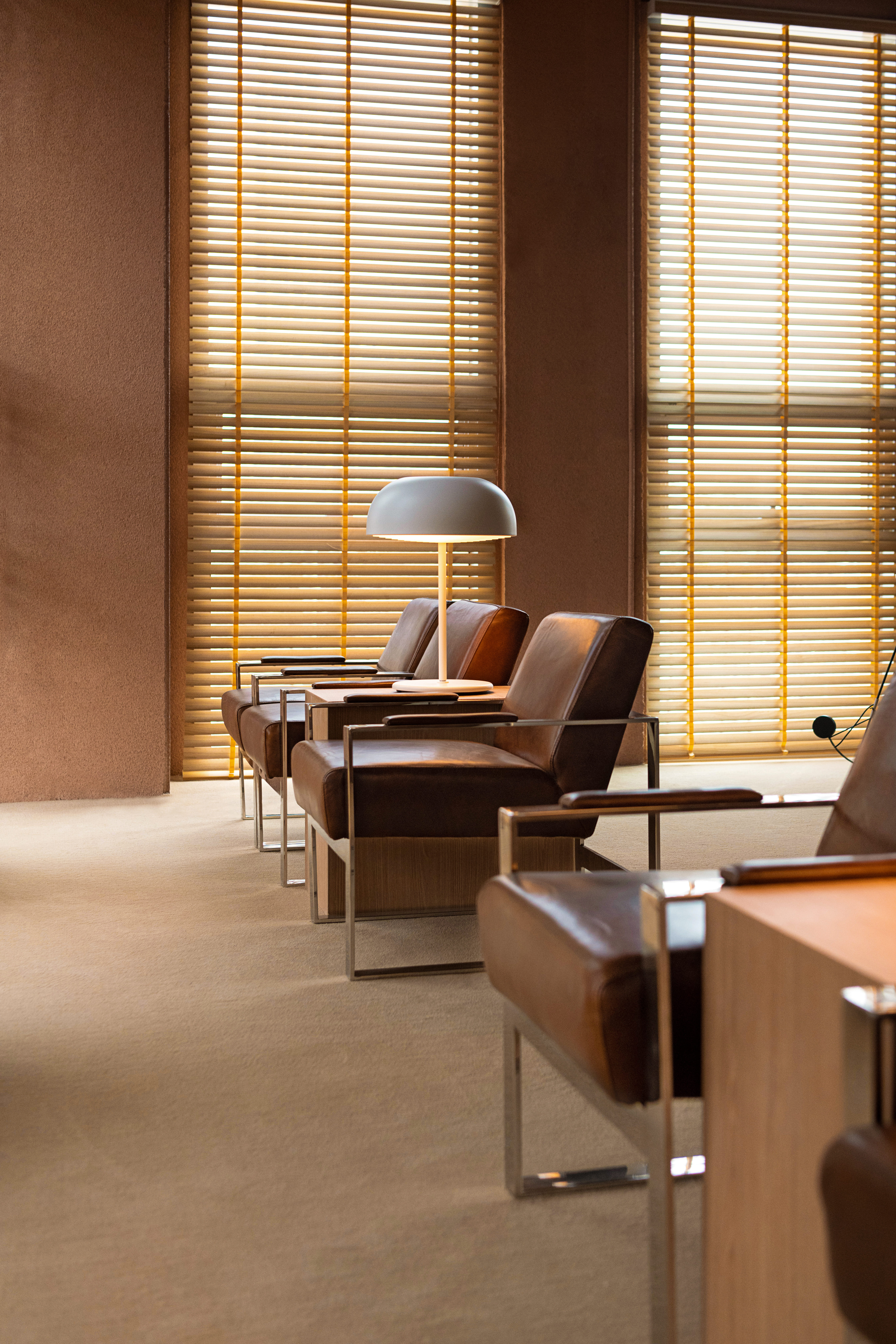
SNU 스마일라식센터는 국내에서 스마일 라식을 최초로 도입한 정의상 원장이 이끄는 시력 교정 전문 클리닉입니다. 이곳은 단순히 시력을 교정하는 곳이 아니라, 삶의 감각을 되찾는 섬세한 기술과 신뢰가 모인 공간입니다. 서비스센터는 클리닉의 브랜드 아이덴티티를 정리하고, 환자에게 더 가까이 다가갈 수 있는 시각 언어를 함께 설계했습니다.
스마일 라식은 극히 일부만을 정밀하게 건드려 시력을 회복하는 첨단 수술 방식입니다. 우리는 이 기술의 본질을 시각적으로 반영하고자 했습니다. 로고와 타이포그래피는 전체를 과하게 드러내기보다, ‘가장 필요한 부분만 정교하게 깎아낸 듯한 조형감’을 통해 고요하지만 신뢰감 있는 인상을 주도록 설계했습니다. 정밀한 기술이 부담 없이 자연스럽게 느껴질 수 있도록, 전반적인 그래픽은 부드럽고 안정된 구조를 유지했습니다.
공간은 건축가 김현종과의 협업으로 완성되었고, 서비스센터는 라운지에 비치된 서가의 책 한 권까지도 큐레이션하며 브랜드 경험을 세심하게 구성했습니다. 병원이 아닌 일상의 한 장면처럼 느껴지는 이 공간에서, 시력은 다시 선명해지고, 시선은 조금 더 편안해지기를 바랍니다.
SNU SMILE LASIK Center is a vision correction clinic led by Dr. Leesang Jung, the first to introduce SMILE LASIK surgery in Korea. This is more than a place for eye correction—it’s a space where precision technology and trust come together to help people regain clarity and a sense of ease in their daily lives. Service Center was responsible for developing the brand identity, crafting a visual language that feels both approachable and grounded in expertise.
SMILE LASIK is a minimally invasive surgical procedure that restores vision by treating only a precise portion of the eye. We aimed to visually reflect the nature of this technique. The logo and typography avoid unnecessary embellishment, instead expressing a quiet confidence—designed to feel as though just the essential parts have been precisely shaped. To ensure the technology feels natural rather than overwhelming, the overall graphic system maintains a calm and balanced tone.
The interior space was completed in collaboration with architect Hyunjoong Kim, and Service Center curated even the books on the lounge shelves to ensure a cohesive brand experience. It’s a clinic designed to feel like a gentle part of everyday life—where vision becomes clear again, and focus is regained with comfort.
SERVICES
브랜드 & 아이덴티티 Brand & Identity
Client - SNU
Branding Development - Service Center
Visual Identity Design - Service Center
Layout Planning - Atelier KHJ
Spatial Design - Atelier KHJ
Interior Construction - Atelier KHJ
Interior Styling - Service Center
Uniform Design - Studio OHYUKYOUNG
Photography - Suman Chun
브랜드 & 아이덴티티 Brand & Identity
︎전략 Strategy
︎네이밍 Naming
︎아이덴티티 Identity
︎그래픽디자인 Graphic Design
︎사진 Photography
︎아트디렉션 Art Direction
︎브랜드 텍스트 Texts for Branding
︎제품 매니지먼트 Product Management공간 Space & Wayfinding
︎사이니지 Signage컨설팅 & 큐레이션 Consulting & Curation
︎서비스 디자인 Service Design
︎방문자 경험 Visitor Experience
︎음악 큐레이션 Music Curation & Mix Set
︎소품 셀렉 Merchandise Curation
Client - SNU
Branding Development - Service Center
Visual Identity Design - Service Center
Layout Planning - Atelier KHJ
Spatial Design - Atelier KHJ
Interior Construction - Atelier KHJ
Interior Styling - Service Center
Uniform Design - Studio OHYUKYOUNG
Photography - Suman Chun
LINKS
[News] ‘에스앤유(SNU)안과 정의상 원장, 대한민국 100대 명의 안과부문 선정’, 베이비뉴스, 2022[Interview] ‘정의상 SNU안과 원장 “스마일라식, 라식라섹의 장점만 취합한 3세대 수술", 월요신문
︎ ︎ ︎
[News] ‘에스앤유(SNU)안과 정의상 원장, 대한민국 100대 명의 안과부문 선정’, 베이비뉴스, 2022[Interview] ‘정의상 SNU안과 원장 “스마일라식, 라식라섹의 장점만 취합한 3세대 수술", 월요신문
︎ ︎ ︎


OBLIV
오블리브는 건물이 완공되기 전부터, 이 공간을 찾게 될 사람들과 그 관계를 어떻게 정의할지에 대한 질문에서 시작된 프로젝트입니다. 서비스센터는 브랜드의 이름을 짓는 것부터 시작해 공간 디자인, 시각 아이덴티티, 안내의 언어, 대기 공간의 가구 배치와 책 한 권까지. 브랜드를 구성하는 거의 모든 접점 위에서 방향을 설정하고 설계했습니다. ‘Obliv’라는 이름은 단순하고 부드러운 어감에서 출발했으며, 단어 구조가 마치 ‘Oh’와 ‘Believe’를 떠올리게 한다는 점에서 직관적인 인상을 만들 수 있다고 보았습니다. 하지만 이 이름은 특정한 의미를 억지로 부여하지 않았고, 오히려 여백 있는 울림으로 브랜드의 태도를 드러냅니다.
우리가 상상한 곳은 보통의 병원 시스템과 조금은 달라야 한다고 생각했습니다. 효율과 동선 중심으로만 설계된 대기실이 아니라, 왜 공항 라운지 같은 편안함과 배려가 있는 공간은 병원 안에 있을 수 없을까 하는 질문이 출발점이었습니다. 특히 피부과는 대부분 민낯으로 방문하는 경우가 많기에, 손님들끼리 마주 앉거나 눈을 마주치는 구조를 피하고, 시선이 자연스럽게 흘러가는 동선 위에 대기 공간을 구성했습니다. 또한 ‘접수처’라는 개념도 다시 생각했습니다. 기존 병원에서는 “기다리시면 불러드릴게요”라고 말하지만, 오블리브에서는 ‘리셉션’에서 “쉬고 계시면 안내해드릴게요”라고 표현하도록 전 직원의 서비스 언어를 정비했습니다. 작지만 중요한 이 차이는, 병원이 일방적인 절차의 공간이 아닌, 사람 중심의 공간이 될 수 있다는 가능성을 보여줍니다.
공간 안에 비치된 책 한 권 한 권 역시 브랜드의 태도를 대신 말합니다. 누구는 샤넬 북을, 누구는 포르쉐에 관한 책을 펼쳐보며 각자의 시간을 보내게 됩니다. 연령과 성별, 관심사에 따라 자연스럽게 손이 가는 책을 큐레이션하여, 대기 시간 또한 취향이 머무는 시간으로 전환됩니다. 오블리브는 피부과라는 특정 목적지에 머물지 않고, 스스로를 돌보는 감각이 조용히 되살아나는 공간이길 바랐습니다. 서비스센터는 이번 프로젝트를 통해, 병원의 정의를 새롭게 설계하고, 그 안에서 ‘기다림’조차 의미 있는 경험이 될 수 있도록 브랜드 전반을 구성했습니다.
Obliv was a project that began even before the building was completed, with a fundamental question: how should we define the relationship between this space and the people who will come to it? Service Center worked from the ground up—starting with naming the brand, then designing the space, visual identity, language of guidance, furniture placement in the waiting area, and even the selection of books on the shelves. The name “Obliv” originated from its simple and soft sound, and its structure subtly evokes a feeling of “Oh” and “Believe.” Rather than assigning a forced meaning, we embraced its quiet resonance to reflect the brand’s tone.
We envisioned a place that would differ from the typical hospital experience. Instead of a waiting room designed solely around efficiency and system flow, we asked: why can’t a clinic feel more like an airport lounge—with comfort and consideration built into the space? Because dermatology patients often arrive bare-faced, we intentionally avoided layouts that would have guests facing each other. The space was designed so that sightlines flow gently without confrontation. We also rethought the role of the reception. In most clinics, the phrase “We’ll call you when it’s your turn” is common, but at Obliv, the staff is trained to say, “Please take a moment to rest—we’ll guide you shortly.” It may seem like a small shift, but the difference between waiting and resting holds meaningful psychological weight.
Even the books placed throughout the space reflect the brand’s attitude. One guest might reach for a Chanel brand book, another for a volume on Porsche. Each title was carefully curated based on age, gender, and interest so that time spent waiting becomes time spent with one’s own taste. Obliv is not merely a destination for dermatology—it’s a place where the act of caring for oneself is gently reawakened. Through this project, Service Center sought to redesign what a clinic can be, making even “waiting” a thoughtful and considered experience.
SERVICES
브랜드 & 아이덴티티 Brand & Identity
Client - Jinyoung Park
Branding Development - Service Center
Visual Identity Design - Service Center
Layout Planning - Service Center
Spatial Design - Giseok Kim
Interior Construction - Service Center
Interior Styling - Service Center
Brand Text - Service Center
Photography - Suman Chun
브랜드 & 아이덴티티 Brand & Identity
︎전략 Strategy
︎네이밍 Naming
︎아이덴티티 Identity
︎그래픽디자인 Graphic Design
︎사진 Photography
︎아트디렉션 Art Direction
︎브랜드 텍스트 Texts for Branding
︎제품 매니지먼트 Product Management공간 Space & Wayfinding
︎인테리어 디자인 Interior Design
︎사이니지 Signage컨설팅 & 큐레이션 Consulting & Curation
︎공간 스타일링 Visual Merchandising
︎서비스 디자인 Service Design
︎방문자 경험 Visitor Experience
︎브랜드 컨설팅 Brand & Business Consulting
︎음악 큐레이션 Music Curation & Mix Set
︎소품 셀렉 Merchandise Curation
Client - Jinyoung Park
Branding Development - Service Center
Visual Identity Design - Service Center
Layout Planning - Service Center
Spatial Design - Giseok Kim
Interior Construction - Service Center
Interior Styling - Service Center
Brand Text - Service Center
Photography - Suman Chun


PIZZA SERVICE
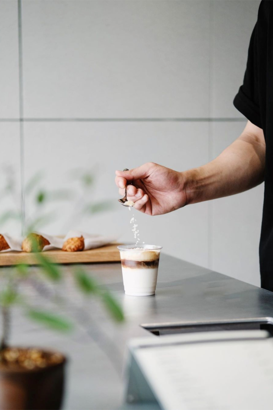
피자서비스는 서비스센터가 직접 기획하고 운영에 참여한 F&B 프로젝트입니다. 늘 브랜드를 만드는 입장이었지만, 이번에는 브랜드를 실제로 실행하고 운영해보자는 아이디어에서 출발해, 오랫동안 신뢰를 쌓아온 셰프, 클라이언트와 함께 운영하는 형태로 시작된 피자집입니다. 우리는 브랜드의 이름부터 시각 아이덴티티, 공간 구성, 메뉴의 어감 하나까지 디테일하게 관여하며, 매장에서의 경험이 브랜드의 태도와 어긋나지 않도록 조율했습니다. ‘피자서비스’라는 이름 역시, 음식보다 먼저 전해지는 태도와 분위기를 담은 단어로 선택했습니다. 이 프로젝트는 단순한 클라이언트 협업이 아닌, 브랜드가 현실 안에서 어떻게 작동하고 유지되는지를 직접 경험해보기 위한 실험이자 실행이었습니다. 서비스센터의가 직접 운영한 첫 번째 프로젝트입니다.
Pizza Service is an F&B project planned and co-operated by Service Center. While we’ve long been in the position of building brands, this time we set out to experience what it’s like to execute and operate one ourselves. The project began as a collaborative venture with a chef and client with whom we had built a strong foundation of trust over time. From naming and visual identity to spatial layout and even the tone of the menu, we were deeply involved in every detail—ensuring that the customer experience aligned seamlessly with the brand’s overall attitude. The name “Pizza Service” was chosen not only to describe the product, but to express the tone and sense of hospitality that arrives before the food itself. This project was more than a client collaboration—it was an experiment and execution in how a brand functions and sustains itself in the real world. It marks Service Center’s first attempt at directly running a brand from the inside out.
SERVICES
브랜드 & 아이덴티티Brand & Identity
Client - M
Branding Development - Service Center
Visual Identity Design - Service Center
Spatial Design - Service Center
Interior Construction -Service Center
Interior Styling - Service Center
Photography - Suman Chun, Service Center
브랜드 & 아이덴티티Brand & Identity
︎전략 Strategy공간 Space & Wayfinding
︎네이밍 Naming
︎아이덴티티 Identity
︎사진 Photography
︎아트디렉션 Art Direction
︎캠페인 Campaigns
︎브랜드 텍스트 Texts for Branding
︎제품 매니지먼트 Product Management
︎SNS전략 Social Media Strategy
︎인테리어 디자인 Interior Design컨설팅 & 큐레이션 Consulting & Curation
︎동선 설계 Wayfinding Strategy
︎사이니지 Signage
︎공간 스타일링 Visual Merchandising
︎서비스 디자인 Service Design
︎방문자 경험 Visitor Experience
︎브랜드 컨설팅 Brand&Business Consulting
︎음식 컨설팅 Food Consulting
︎음악 큐레이션 Music Curation & Mix Set
︎소품 셀렉 Merchandise Curation
Client - M
Branding Development - Service Center
Visual Identity Design - Service Center
Spatial Design - Service Center
Interior Construction -Service Center
Interior Styling - Service Center
Photography - Suman Chun, Service Center


FLOCK
플록은 제주도 제주시에 위치한 카페로, 클라이언트의 기획을 바탕으로 시작된 프로젝트입니다. 단순한 카페 이상의 성격을 가진 이 공간은, 세계 각지의 스페셜티 원두를 모아 손님이 직접 고를 수 있도록 하고, 브랜드 굿즈를 제작·판매하는 등 편집숍 같은 구성을 지향했습니다. 공간은 쉬기 좋은 카페의 역할을 하면서도, 물건이 멋지게 진열되고, 일하는 사람들의 모습까지도 하나의 풍경처럼 보일 수 있도록 설계했습니다. 바와 키친은 기능뿐 아니라 시각적으로도 인상적이도록 구조화했고, 공간 전체가 브랜드의 인상을 자연스럽게 전달할 수 있도록 구성했습니다. 플록은 제주의 라이프스타일 안에 새로운 감도를 제안하고자 했던 프로젝트입니다.
FLOCK is a café located in Jeju City, South Korea, launched based on the client’s initial concept. Designed to be more than just a typical café, the space offers a curated experience—featuring specialty beans from around the world that customers can choose from, and branded goods that are produced and sold on-site, giving it the feel of a concept store. While the café functions as a comfortable place to relax, it was also designed so that products could be beautifully displayed and the staff at work could become part of the visual landscape. The bar and kitchen areas were structured not only for efficiency but to leave a strong visual impression, allowing the brand’s identity to be communicated naturally through the spatial experience. FLOCK was a project aimed at offering a new kind of sensibility within Jeju’s lifestyle. Service Center helped establish the foundation of the brand so that its rhythm and tone could flow consistently across the space, products, and customer interactions.
SERVICES
브랜드 & 아이덴티티Brand & Identity
Client - Seung-Min Jung
Branding Development - Service Center
Visual Identity Design - Service Center
Spatial Design - Service Center
Interior Construction - Service Center
Photography - Suman Chun
브랜드 & 아이덴티티Brand & Identity
︎전략 Strategy공간 Space & Wayfinding
︎네이밍 Naming
︎아이덴티티 Identity
︎사진 Photography
︎아트디렉션 Art Direction
︎제품 매니지먼트 Product Management
︎인테리어 디자인 Interior Design컨설팅 & 큐레이션 Consulting & Curation
︎동선 설계 Wayfinding Strategy
︎사이니지 Signage
︎공간 스타일링 Visual Merchandising
︎서비스 디자인 Service Design
︎방문자 경험 Visitor Experience
︎브랜드 컨설팅 Brand & Business Consulting
︎음악 큐레이션 Music Curation & Mix Set
︎소품 셀렉 Merchandise Curation
Client - Seung-Min Jung
Branding Development - Service Center
Visual Identity Design - Service Center
Spatial Design - Service Center
Interior Construction - Service Center
Photography - Suman Chun
LINKS


BLUE PORTRAIT
블루포트레이트는 서비스센터와 오랜 인연을 이어온 카페썸모어의 이지은 셰프, 그리고 그녀의 친동생 이지훈 대표와 함께 만든 작은 술집입니다. 이 공간은 대단한 요리보다, 가볍고 간단한 안주거리와 함께 술을 즐길 수 있는 편안한 곳으로 기획되었습니다. 적은 예산 안에서 기존 공간의 요소들을 최대한 활용해, 최소한으로 블루포트레이트만의 분위기를 만들어내는 것이 이번 프로젝트의 핵심이었습니다.
이름과 아이덴티티는 서비스센터가 제안했습니다. ‘블루포트레이트(Blue Portrait)’라는 이름은 이 남매의 추억 속 사진을 하나의 푸른빛 초상으로 전환해 로고와 함께 사용하는 아이디어에서 출발했습니다. 단순한 이미지가 아니라, 공간을 이끄는 두 사람의 관계와 추억을 상징적으로 담은 장치였습니다. 로고에 담긴 푸른 톤은 이 공간의 감도와 정서를 자연스럽게 이끌어주는 역할을 했습니다.
블루포트레이트는 가족과 친구, 주변의 동료들이 자연스럽게 모이는 사랑방 같은 공간이 되었습니다. 서비스센터는 이곳이 기억이 쌓여가는 추억의 장소가 되기를 바랐습니다. 작지만 따뜻한 온도를 가진 공간, 블루포트레이트는 그렇게 탄생했습니다.
Blue Portrait is a small bar created in collaboration with Service Center, longtime partner of Café Some More, chef Jieun Lee, and her younger brother, Jihoon Lee. Rather than focusing on elaborate cuisine, the space was designed as a relaxed place where guests could enjoy simple snacks and drinks. Working with a limited budget, we made use of the space’s existing elements, aiming to bring out a unique atmosphere with minimal intervention.
The name and identity were proposed by Service Center. “Blue Portrait” was inspired by an old photograph of the siblings, reimagined as a blue-tinted portrait that now forms the core of the logo. This wasn’t just a design element—it symbolically captured the bond and shared memories of the two people behind the space. The cool blue tone embedded in the identity helps shape the overall mood and emotional tone of the bar. Over time, Blue Portrait has become a kind of neighborhood salon—a warm and familiar gathering place for family, friends, and close collaborators. Service Center hoped this space would become a place where memories quietly accumulate. Blue Portrait was born as a small but heartfelt space, defined not by its scale, but by its warmth.
SERVICES
브랜드 & 아이덴티티Brand & Identity
Client - Jihun Lee
Branding Development - Service Center
Visual Identity Design - Service Center
Spatial Design - Service Center
Interior Construction - Service Center
Photography - Suman Chun
브랜드 & 아이덴티티Brand & Identity
︎전략 Strategy공간 Space & Wayfinding
︎네이밍 Naming
︎아이덴티티 Identity
︎사진 Photography
︎아트디렉션 Art Direction
︎제품 매니지먼트 Product Management
︎인테리어 디자인 Interior Design컨설팅 & 큐레이션 Consulting & Curation
︎동선 설계 Wayfinding Strategy
︎공간 스타일링 Visual Merchandising
︎서비스 디자인 Service Design
︎방문자 경험 Visitor Experience
︎브랜드 컨설팅 Brand & Business Consulting
︎음악 큐레이션 Music Curation & Mix Set
︎소품 셀렉 Merchandise Curation
Client - Jihun Lee
Branding Development - Service Center
Visual Identity Design - Service Center
Spatial Design - Service Center
Interior Construction - Service Center
Photography - Suman Chun
LINKS


YUHANA CAKE
유하나케이크는 인천 구월동에서 케이크 맛집으로 이미 많은 팬들에게 사랑받던 카페였습니다. 서비스센터는 이 브랜드의 리브랜딩 프로젝트를 함께하며, 매장 디자인과 시각 아이덴티티 전반을 새롭게 정리했습니다. 익숙한 브랜드가 새로운 감도로 다시 시작할 수 있도록, 기존의 매력을 해치지 않으면서도 더 분명한 방향을 제시하는 것이 목표였습니다.
공간은 손님들이 케이크를 편하게 즐길 수 있는 구조로 설계되었지만, 동시에 유하나케이크의 조각 하나하나가 마치 작은 보석처럼 느껴질 수 있도록 진열 방식과 시각 언어를 섬세하게 조율했습니다. 진열장 앞에 선 손님이 하나의 케이크를 고를 때, 단순한 디저트가 아닌 소중한 선택처럼 느껴지기를 바랐습니다.
이번 리브랜딩은 단순한 외형의 변화가 아니라, 유하나라는 브랜드가 가진 정서와 정성을 더 명확하게 보여주는 작업이었습니다. 케이크를 고르는 순간의 즐거움이 오래 남도록 디자인했습니다.
YUHANA CAKE is a well-loved café in Guwol-dong, Incheon, known for its cakes and a loyal fan base. Service Center collaborated on the brand’s rebranding project, redesigning both the store interior and the overall visual identity. Our goal was to guide a familiar brand into a new sensibility—without losing its existing charm, but rather offering a clearer and more refined direction.
The space was designed to allow customers to enjoy their cake comfortably, while also making each slice feel like a small jewel. From the display layout to the visual language, we carefully tuned every detail so that choosing a cake would feel less like selecting a dessert and more like making a thoughtful, personal choice.
This rebranding was not just about changing the look of the brand—it was about expressing YUHANA’s underlying warmth and care more clearly. We designed the experience so that the simple act of choosing a cake would leave a lasting impression.
SERVICES
브랜드 & 아이덴티티Brand & Identity
Client - Hana Yu
Branding Development - Service Center
Visual Identity Design - Service Center
Spatial Design - Service Center
Photography - Suman Chun
브랜드 & 아이덴티티Brand & Identity
︎전략 Strategy공간 Space & Wayfinding
︎아이덴티티 Identity
︎사진 Photography
︎아트디렉션 Art Direction
︎제품 매니지먼트 Product Management
︎인테리어 디자인 Interior Design컨설팅 & 큐레이션 Consulting & Curation
︎동선 설계 Wayfinding Strategy
︎공간 스타일링 Visual Merchandising
︎서비스 디자인 Service Design
︎방문자 경험 Visitor Experience
︎브랜드 컨설팅 Brand & Business Consulting
︎음악 큐레이션 Music Curation & Mix Set
Client - Hana Yu
Branding Development - Service Center
Visual Identity Design - Service Center
Spatial Design - Service Center
Photography - Suman Chun
LINKS


WOODY
WOODY는 인천 부평의 한 골목에 새로 문을 연 남성 의류 편집숍입니다. 서비스센터는 이 브랜드의 첫 공간을 함께하며, 작은 면적 안에서도 이곳만의 공간적 매력을 갖출 수 있도록 공간 디자인을 중심으로 프로젝트를 진행했습니다.
작은 매장이지만, 피팅룸과 계산대, 포장 공간, 창고 등 운영에 필요한 기능을 모두 갖추는 것이 중요했습니다. 동시에 제품 하나하나가 돋보일 수 있어야 했고, 고객이 매장을 편하게 둘러볼 수 있도록 동선과 진열 방식에 특히 신경 썼습니다. 공간의 구조와 동선이 브랜드의 인상을 대신 전달하는 만큼, 기능성과 감도 사이의 균형을 고민했습니다.
우리는 이 작은 편집숍이 단순한 소매 공간을 넘어, 브랜드가 가진 분위기와 취향을 선명하게 보여주는 장소가 될 수 있도록 구성했습니다.
WOODY is a newly opened men's select shop located in a quiet alley in Bupyeong, Incheon. Service Center worked on the brand’s first physical space, focusing on spatial design to ensure the shop had its own distinct appeal, even within a small footprint.
Though compact, the space needed to function fully—with fitting rooms, a checkout counter, packing area, and storage—all seamlessly integrated. At the same time, each product had to stand out, and customers needed to move through the store comfortably. We paid particular attention to layout and display, understanding that the structure and flow of a space can shape the overall impression of a brand. It was a balance between function and sensibility.
WOODY was designed not just as a retail space, but as a place where the brand’s atmosphere and aesthetic could be clearly expressed.
SERVICES
브랜드 & 아이덴티티Brand & Identity
Client - Woody
Branding Development - Service Center
Visual Identity Design - Service Center
Spatial Design - Service Center
Interior Construction - Daejong Kim
Photography - Suman Chun
브랜드 & 아이덴티티Brand & Identity
︎아이덴티티 Identity공간 Space & Wayfinding
︎사진 Photography
︎제품 매니지먼트 Product Management
︎인테리어 디자인 Interior Design컨설팅 & 큐레이션 Consulting & Curation
︎동선 설계 Wayfinding Strategy
︎공간 스타일링 Visual Merchandising
︎서비스 디자인 Service Design
︎방문자 경험 Visitor Experience
︎브랜드 컨설팅 Brand & Business Consulting
︎음악 큐레이션 Music Curation & Mix Set
Client - Woody
Branding Development - Service Center
Visual Identity Design - Service Center
Spatial Design - Service Center
Interior Construction - Daejong Kim
Photography - Suman Chun
LINKS


LINCHPIN
린치핀은 송도에 위치한, 직접 로스팅으로 운영되는 카페 브랜드입니다. ‘Linchpin’은 바퀴나 축의 중심을 고정하는 작은 핀을 뜻하며, 브랜드의 중심에 있는 정신을 상징하는 이름이기도 했습니다. 클라이언트는 이 이름을 강하게 선호했고, 린치핀이라는 이름을 중심으로 브랜드를 풀어가길 원했습니다.
공간 디자인은 클라이언트가 애정하는 블랙 컬러를 적극적으로 반영하되, 짙은 회색과 중간 톤을 섞어 너무 무겁지 않게 조율했습니다. 시크한 무드를 유지하면서도 방문객에게 부담을 주지 않도록 재질과 조명의 균형을 맞췄습니다. 가장 중심이 되는 커피 바는 단을 높여 설계했는데, 이는 손님들이 자연스럽게 둘러앉아 커피를 기다리며 바리스타들의 움직임을 바라볼 수 있도록 하기 위함이었습니다.
단 차이와 동선을 활용해, 손님이 공간을 이동하며 색다르게 체감할 수 있는 구조를 만들었습니다. 이 작은 변화들이 공간에 리듬을 더했고, 린치핀이라는 이름에 걸맞게 중심은 견고하되, 그 주변에서 다양한 시선과 경험이 자연스럽게 만들어지는 곳이 되기를 바랐습니다.
Linchpin is a café brand located in Songdo, operated with an in-house roasting system. The name “Linchpin” refers to a small pin that secures the center of a wheel or axis—symbolizing the brand’s philosophy of stability and focus. The client had a strong attachment to the name and wanted the entire brand to be built around this concept.
The space design prominently features the client’s preferred black color, balanced with deep grays and mid-tones to avoid heaviness. While maintaining a sleek and refined mood, the materials and lighting were carefully adjusted to keep the atmosphere welcoming. The centerpiece, the coffee bar, was intentionally elevated—allowing guests to sit around it and observe the baristas at work as they wait for their drinks.
By incorporating shifts in elevation and asymmetrical circulation, the space invites visitors to experience it in dynamic ways. These subtle changes added rhythm to the interior, creating a space where, true to the name Linchpin, a strong center anchors a variety of perspectives and interactions unfolding around it.
SERVICES
브랜드 & 아이덴티티Brand & Identity
Client - Jung-Gyun Lee
Branding Development - Service Center
Visual Identity Design - Service Center
Spatial Design - Service Center
Interior Construction -Flip Design
Photography - Suman Chun
브랜드 & 아이덴티티Brand & Identity
︎전략 Strategy공간 Space & Wayfinding
︎아이덴티티 Identity
︎사진 Photography
︎아트디렉션 Art Direction
︎제품 매니지먼트 Product Management
︎인테리어 디자인 Interior Design컨설팅 & 큐레이션 Consulting & Curation
︎동선 설계 Wayfinding Strategy
︎공간 스타일링 Visual Merchandising
︎서비스 디자인 Service Design
︎방문자 경험 Visitor Experience
︎브랜드 컨설팅 Brand & Business Consulting
︎음악 큐레이션 Music Curation & Mix Set
︎소품 셀렉 Merchandise Curation
Client - Jung-Gyun Lee
Branding Development - Service Center
Visual Identity Design - Service Center
Spatial Design - Service Center
Interior Construction -Flip Design
Photography - Suman Chun


PEACE KOREA X OBJECT
한국인에게 익숙한 스테이플러 브랜드, 평화(피스코리아)는 오랫동안 신뢰할 수 있는 사무용품으로 자리해왔지만, 주로 사무실에서 사용하는 제품이라는 인식 탓에 젊은 세대와는 다소 거리가 있었습니다. 이번 프로젝트는 홍대의 문구 편집숍 오브젝트(Object)의 제안으로 시작되었고, 평화라는 브랜드가 가진 탄탄한 기술력과 오랜 역사에 새로운 접근을 더해보자는 취지로 기획되었습니다.
서비스센터는 전시 기획과 브랜딩 디자인 전반을 맡아, 평화를 보다 감각적이고 가까운 브랜드로 전달하기 위한 컨셉을 개발했습니다. ‘평화대학’이라는 가상의 대학과 그 안의 ‘스테이플러학과’라는 설정을 기반으로, 대학교 굿즈 같은 스웻셔츠, 학과 로고 스티커, 브로셔 등의 제품과 콘텐츠를 구성했습니다. 이 설정은 브랜드를 어렵지 않고 유쾌하게 풀어내기 위한 장치였으며, 전시 공간은 하나의 학과 전공 소개 공간처럼 연출했습니다.
가장 주목할 만한 시도 중 하나는, 기존 평화 스테이플러 제품에서는 시도된 적 없는 컬러 조합 실험이었습니다. 각 부품을 다양한 컬러로 분할 생산하고, 그것들을 조합해 수십 가지의 컬러 베리에이션을 구성해 제품화했습니다. 이 조합은 젊은 고객들이 스테이플러라는 제품을 취향의 관점에서 다시 바라보게 만들었고, 전시 이후 실제로 빠르게 소진될 만큼 긍정적인 반응을 얻었습니다. 이번 프로젝트는 오래된 브랜드가 새로운 세대와 어떻게 유연하게 소통할 수 있는지를 실험한, 하나의 유쾌한 결과물이었습니다.
Peace Korea is a stapler brand long familiar to many Koreans and has been trusted for decades as a reliable office supply. However, it has often been perceived as a product used mainly in workplace settings, making it feel distant from younger generations. This project began as a proposal from Object, a stationery concept store in Hongdae, with the goal of giving Peace a fresh and creative perspective rooted in its strong technical heritage.
Service Center led the exhibition planning and branding design, developing a concept that would reintroduce Peace in a more approachable and visually engaging way. We created a fictional setting called “Peace University” with a dedicated “Department of Staplers,” and developed a series of goods and content around it—such as university-style sweatshirts, department logo stickers, and brochures. This playful academic narrative served as a lighthearted framework to make the brand feel more relatable. The exhibition space itself was designed to feel like a major introduction room at an actual university.
One of the most notable aspects of the project was the experiment with product colors—something Peace had never done before. Each part of the stapler was manufactured in multiple colors, allowing for dozens of unique combinations and variations. This allowed younger audiences to view the stapler not just as a tool, but as a customizable object of taste. The response was overwhelmingly positive, with many of the items selling out quickly after the exhibition. This project became a joyful example of how a legacy brand can communicate more fluidly with a new generation.
SERVICES
브랜드 & 아이덴티티Brand & Identity
Client - Object, Peace Korea
Branding Development - Service Center
Visual Identity Design - Service Center
Graphic Design - Service Center
Pop-up Concept, Styling - Service Center
브랜드 & 아이덴티티Brand & Identity
︎전략 Strategy공간 Space & Wayfinding
︎아이덴티티 Identity
︎사진 Photography
︎아트디렉션 Art Direction
︎제품 매니지먼트 Product Management
︎전시 디자인 Exhibition Design컨설팅 & 큐레이션 Consulting & Curation
︎동선 설계 Wayfinding Strategy
︎공간 스타일링 Visual Merchandising
︎서비스 디자인 Service Design
︎방문자 경험 Visitor Experience
︎음악 큐레이션 Music Curation & Mix Set
︎소품 셀렉 Merchandise Curation
Client - Object, Peace Korea
Branding Development - Service Center
Visual Identity Design - Service Center
Graphic Design - Service Center
Pop-up Concept, Styling - Service Center
LINKS
[News] ‘피스코리아 x 오브젝트’ 스테플러 학과 전시 개최, eyesmag, 2020 [Book] ‘오브젝트의 사물’, 오브젝트생활연구소, 2020 [Blog] ‘‘호치키스’ 아니라 ‘스테플러’ 얼마나 아시나요, 브런치’, 2020 [Blog] ‘국민 스테플러의 화려한 변신’, 브런치, 2024
[News] ‘피스코리아 x 오브젝트’ 스테플러 학과 전시 개최, eyesmag, 2020 [Book] ‘오브젝트의 사물’, 오브젝트생활연구소, 2020 [Blog] ‘‘호치키스’ 아니라 ‘스테플러’ 얼마나 아시나요, 브런치’, 2020 [Blog] ‘국민 스테플러의 화려한 변신’, 브런치, 2024


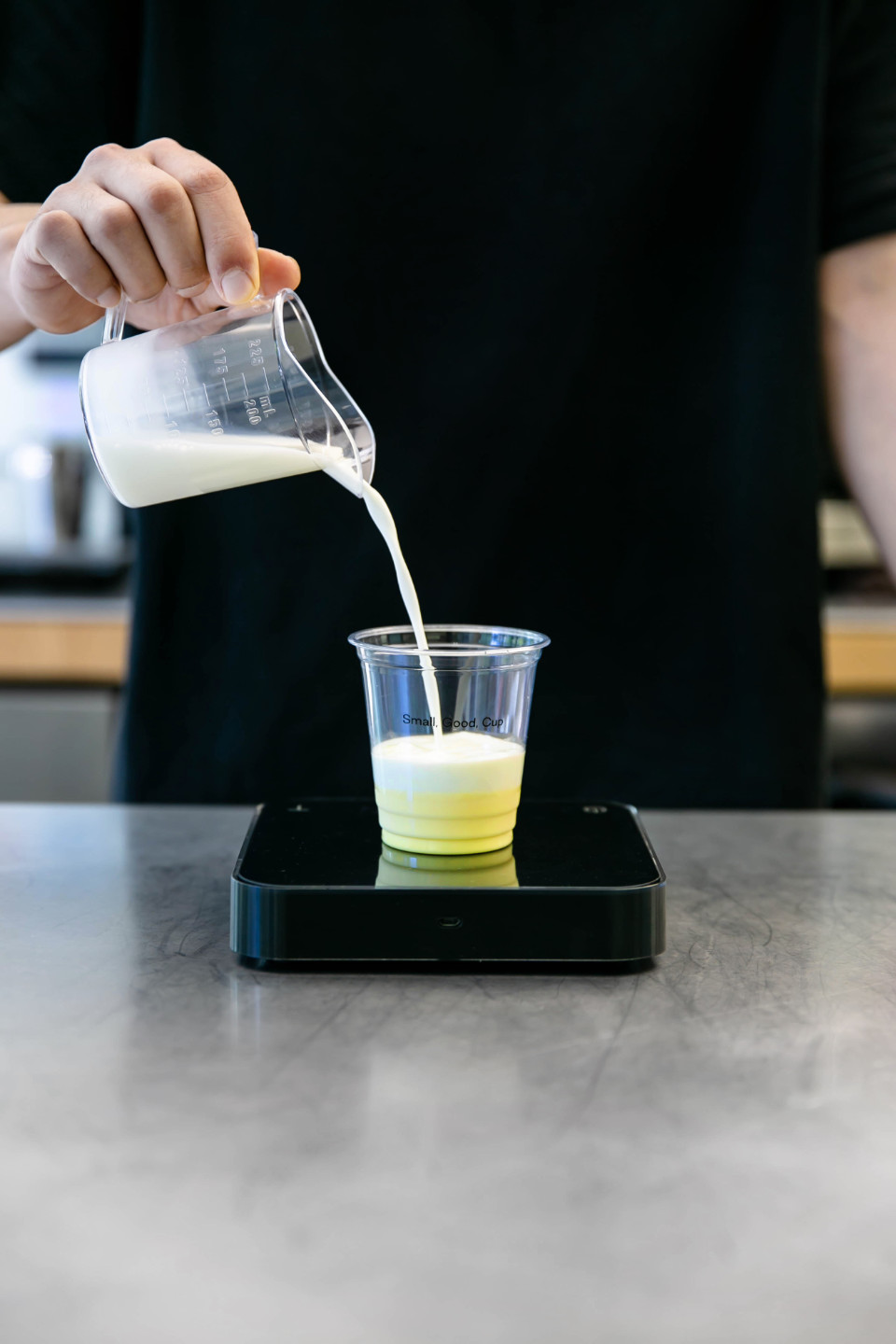
SMALL, GOOD, COFFEE
Small Good Coffee는 저가 커피 시장에 새롭게 진입한 브랜드로, 단순히 ‘가격 대비 품질이 좋은 커피’ 이상의 철학에서 출발했습니다. 클라이언트는 좋은 품질을 제공하기 위해서는 단순히 원두나 맛의 영역이 아니라, 비즈니스 구조 전반에 걸쳐 혁신이 필요하다고 보았고, 실제로 최소한의 동선과 시스템 설계로 높은 운영 효율을 달성해냈습니다. 서비스센터는 이러한 기획의 방향성과 구조적 철학이 브랜드 전반에 드러나야 한다고 생각했고, 이름부터 그 태도가 전달될 수 있도록 접근했습니다.
우리는 ‘작지만 좋은 커피’라는 명확한 메시지를 이름에 담아 Small Good Coffee라는 네이밍을 제안했습니다. 이 이름은 브랜드가 지향하는 가치를 직접적으로 드러내면서도, 시장의 수많은 커피 브랜드들 사이에서 기억될 수 있는 간결함을 가졌습니다. 로고와 비주얼 아이덴티티는 브랜드가 가진 구조적 정직함과 효율성, 그리고 일상의 커피로서의 접근성을 시각적으로 정리하는 데 집중했습니다. 브랜드는 처음 론칭 후 빠르게 시장의 반응을 얻으며 매장 수를 늘려가고 있으며, 이름이 지닌 명료함과 일관된 구조는 각 매장에서도 안정적으로 기능하고 있습니다.
이번 프로젝트는 커피라는 제품을 넘어서, 브랜드의 핵심 철학이 이름, 공간, 시스템 전반에 어떻게 연결될 수 있는지를 고민한 작업이었습니다. 작지만 좋은 것, 단순하지만 타협하지 않은 것. Small Good Coffee는 그 말 그대로 브랜드의 방향과 철학이 가장 단순한 언어로 전달될 수 있다는 것을 보여준 사례였습니다. 서비스센터는 그 구조적 자신감을 브랜드 언어로 치환하는 과정을 함께 설계했습니다.
Small Good Coffee is a new brand entering the affordable coffee market, founded on a philosophy that goes beyond simply offering “good coffee at a low price.” The client believed that delivering real quality required innovation not only in beans or taste, but across the entire business structure. By designing efficient systems and minimizing operational flow, they achieved a model that made both quality and price possible. Service Center approached the project with the belief that this structural philosophy should be reflected in the brand itself—starting with the name.
We proposed the name Small Good Coffee, a phrase that directly conveys the brand’s values: small in scale, but uncompromising in quality. The name is concise and memorable, standing out in a crowded market. The logo and visual identity were designed to reflect the brand’s clarity, operational honesty, and its role as a simple, everyday coffee. Since its launch, the brand has gained rapid traction in the market, with the clarity and consistency of its identity system supporting its growth across multiple locations.
This project was not just about coffee, but about translating a brand’s core philosophy into language, space, and system. Small but good. Simple but uncompromising. Small Good Coffee is a clear example of how a brand’s direction and values can be delivered through the most direct and honest language. Service Center worked to shape and express that structural confidence through the brand itself.
SERVICES
브랜드 & 아이덴티티Brand & Identity
Client - B. Park
Branding Development - Service Center
Playlist Mix - Tom Choi
Visual Identity Design - Service Center
Spatial Design - Minusfront
Interior Construction - Minusfront
Photography - Minusfront
브랜드 & 아이덴티티Brand & Identity
︎네이밍 Naming
︎아이덴티티 Identity
︎브랜드 텍스트 Texts for Branding공간 Space & Wayfinding
︎제품 매니지먼트 Product Management
︎SNS전략 Social Media Strategy
︎사이니지 Signage
︎방문자 경험 Visitor Experience컨설팅 & 큐레이션 Consulting & Curation
︎음악 큐레이션 Music Curation & Mix Set
︎소품 셀렉 Merchandise Curation
Client - B. Park
Branding Development - Service Center
Playlist Mix - Tom Choi
Visual Identity Design - Service Center
Spatial Design - Minusfront
Interior Construction - Minusfront
Photography - Minusfront


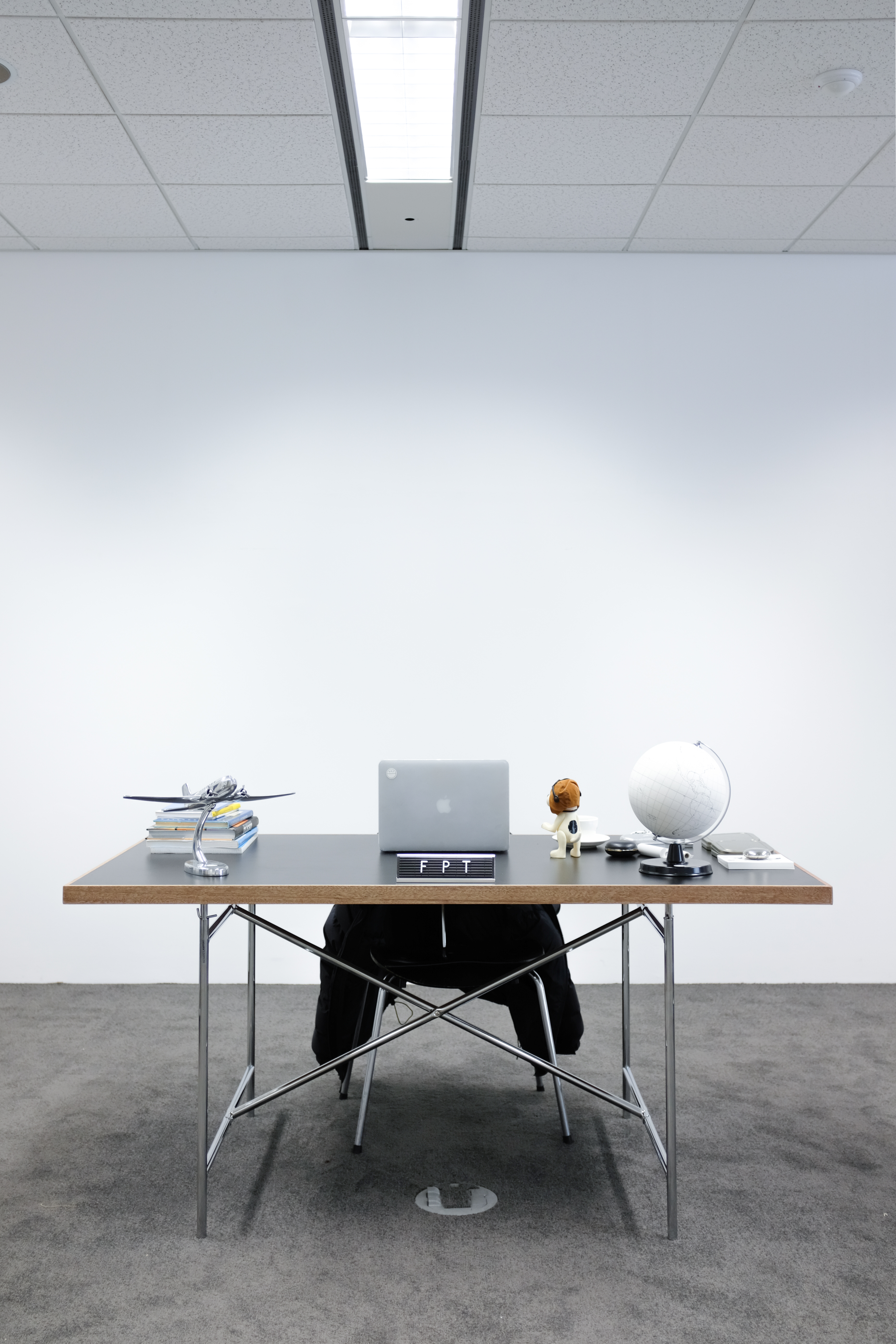
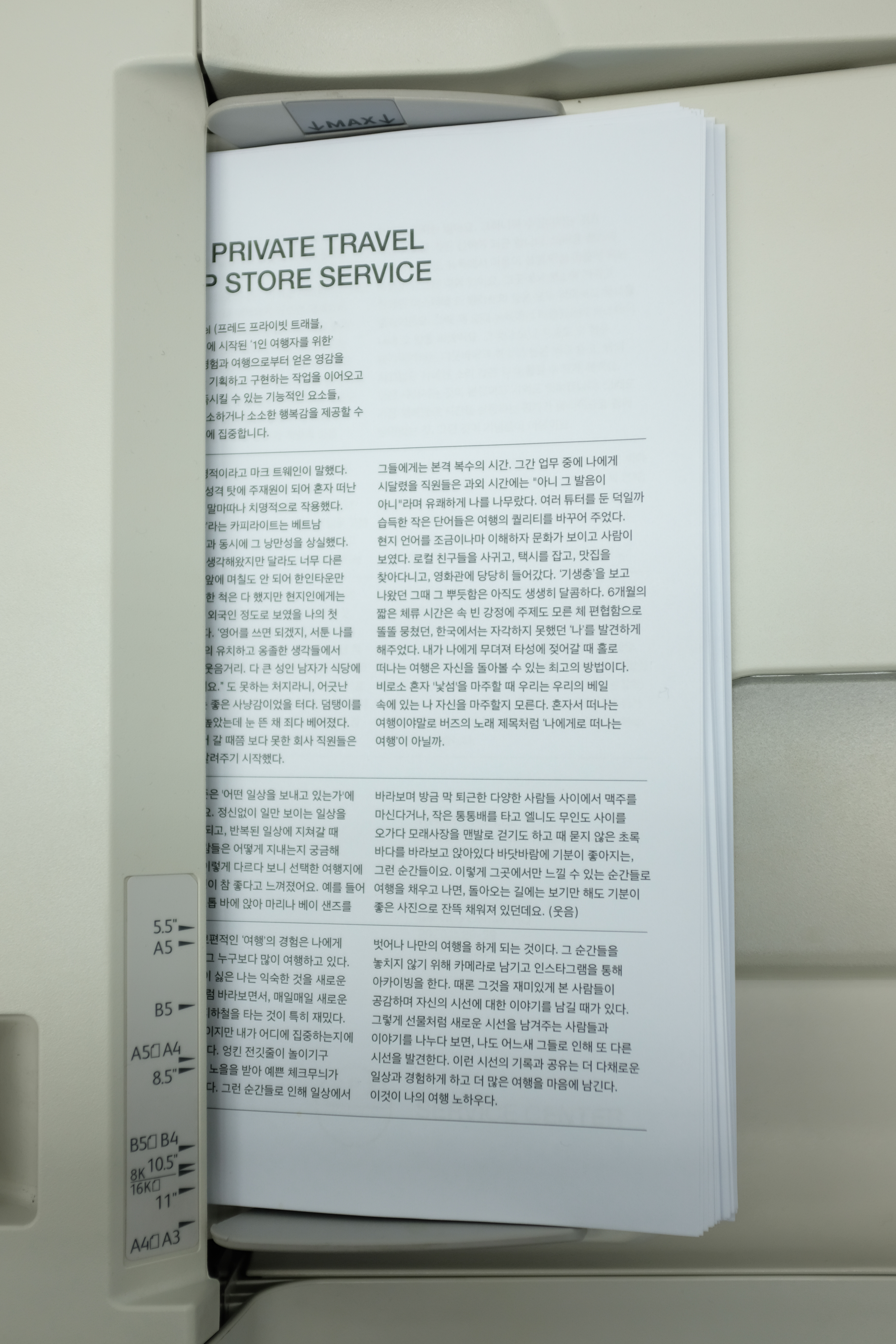
FPT X SERVICE CENTER
Frede Private Travel과의 협업은 “이거 우리끼리 하면 재밌지 않을까?”라는 가벼운 제안에서 시작되었습니다. FPT의 대표가 일정 기간 서비스센터 송도 HQ의 한 켠에서 함께 책상을 나누어 쓰며 업무를 보았고, 우리는 그것을 하나의 팝업으로 부르기로 했습니다. 특별한 목적이 있었던 기획은 아니었지만, 그렇게 자연스럽게 공간을 공유하면서 일상 속 협업이 시작되었습니다.
FPT는 ‘1인 여행자’를 위한 감각적이고 실용적인 아이템을 만들어온 브랜드로, 여행과 일상 사이의 감도를 잘 아는 파트너였습니다. 이 프로젝트에서는 두 브랜드가 함께 기념 모자를 제작했습니다. 함께 시간을 보내는 동안, 우리가 좋아하는 감각을 담아 자연스럽게 만들어진 결과물입니다.
이 협업은 결과뿐 아니라 과정까지 유쾌했던 기억으로 남아 있습니다. 우리가 공간과 브랜드를 다룰 때 중요하게 여기는 감각 중 하나는 ‘무언가를 꼭 증명하지 않아도 되는 관계에서 나올 수 있는 유연함’인데, 이번 프로젝트는 그런 감각이 온전히 담긴 사례였습니다.
Our collaboration with Frede Private Travel began with a simple idea: “Wouldn’t it be fun if we just did this together?” For a period of time, the founder of FPT shared a desk with us at Service Center’s HQ in Songdo, working alongside our team. We decided to call it a pop-up. There was no grand objective behind the project—just a shared space and a natural start to a casual, everyday collaboration.
FPT is a brand known for its thoughtful and practical products designed for solo travelers—a partner who intuitively understands the pace between travel and everyday life. During this project, the two brands came together to create a commemorative hat. It was a small result that naturally emerged from the time we spent together, shaped by the sensibilities we both enjoy.
This collaboration remains a pleasant memory, not only for what came out of it, but for how it unfolded. One thing we value when working with brands and spaces is a certain flexibility—the kind that can only come from relationships where nothing needs to be proven. This project was a quiet, complete example of that.
SERVICES
콜라보레이션 Collaboration
팝업스토어 Pop-up Store
공간 Space & Wayfinding
Graphic Design - Service Center
Photography - Service Center
콜라보레이션 Collaboration
팝업스토어 Pop-up Store
공간 Space & Wayfinding
︎전시 기획 Exhibition Planning
︎전시 디자인 Exhibition Design
︎방문자 경험 Visitor Experience
Graphic Design - Service Center
Photography - Service Center
LINKS


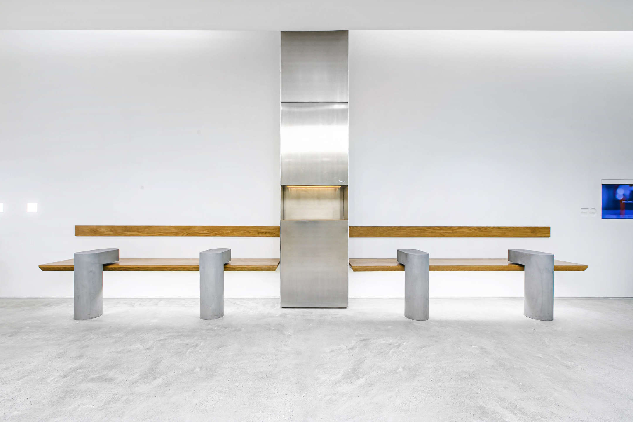
SERVICE CENTER SONGDO
서비스센터의 첫 번째 사무실은, 클래식한 사무 빌딩의 한 층 구석에 자리하고 있었습니다. 정돈된 복도 끝, 유리문을 열면 회색 카페트가 깔린 조용한 공간이 나타났습니다. 우리는 이곳을 단순한 작업 공간으로만 두지 않기로 했습니다. 협업과 실험, 때때로 팝업 전시나 모임이 가능하도록 공간의 구조와 환경을 유연하게 설계했습니다. 작지만 단단한 이 공간은, 서비스센터가 처음 ‘브랜드를 다루는 방식’을 실험하고 정립해 나가던 출발점이었습니다.
Service Center’s first office was tucked into a corner of a floor in a classic office building. At the end of a quiet, orderly hallway, a glass door opened into a calm space lined with gray carpet. We chose not to treat it as just a place to work. Instead, we shaped it as a flexible environment—one that allowed for collaboration, experimentation, and occasionally, pop-up exhibitions or gatherings. Though modest in size, this space marked the beginning of how Service Center began to define and refine its own approach to branding.
SERVICES
공간 Space & Wayfinding
Creative Direction - Service Center
Spatial Design - Service Center
Interior Construction - Bonwoong Gu
Photography - Seungsoo Kim
공간 Space & Wayfinding
︎인테리어 디자인 Interior Design
︎사이니지 Signage
︎공간 스타일링 Visual Merchandising
︎서비스 디자인 Service Design
︎방문자 경험 Visitor Experience
Creative Direction - Service Center
Spatial Design - Service Center
Interior Construction - Bonwoong Gu
Photography - Seungsoo Kim
LINKS


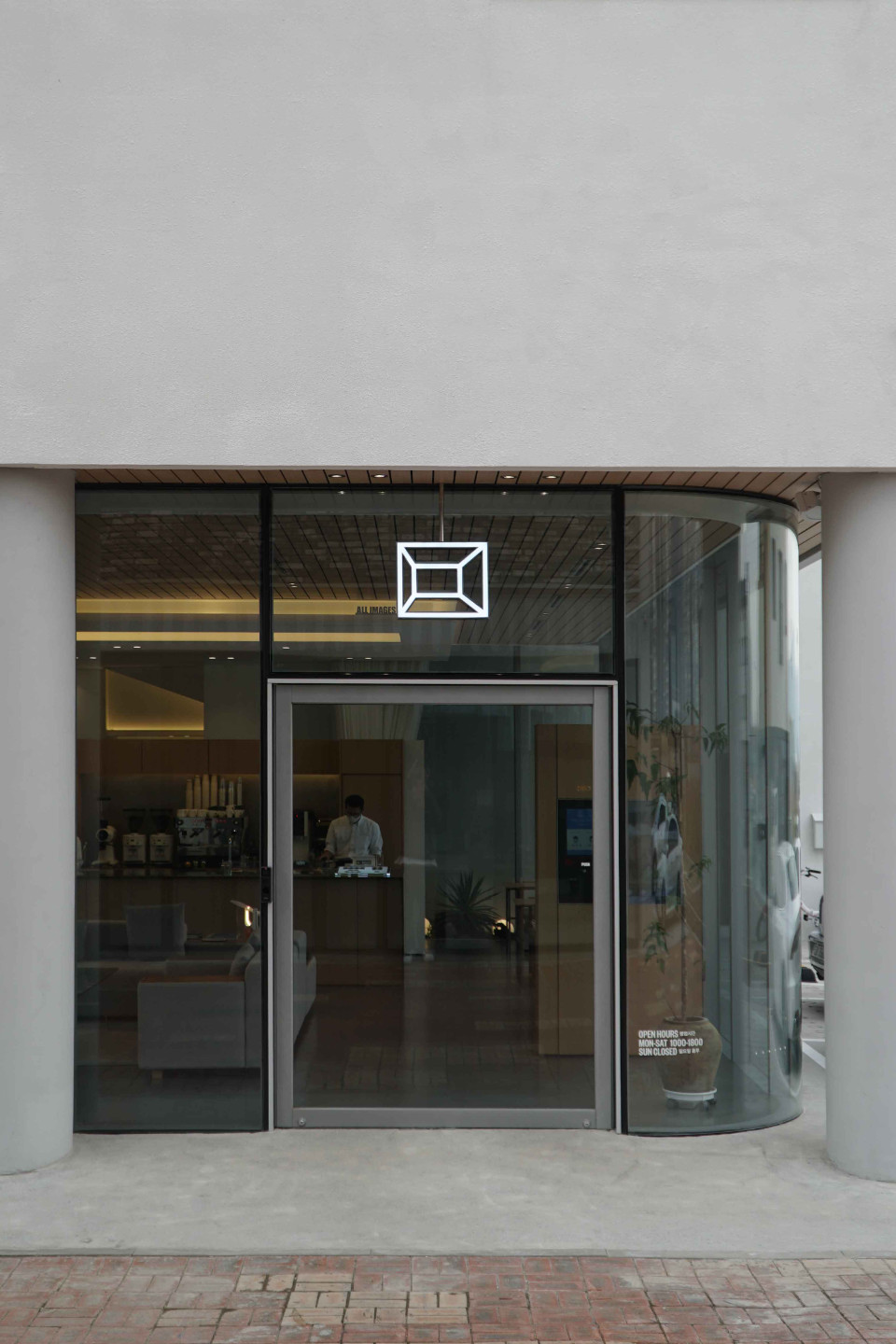
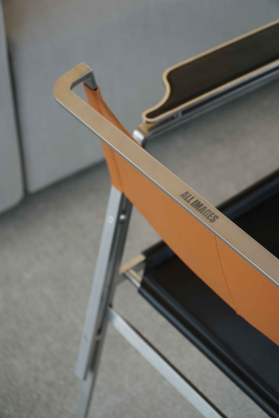
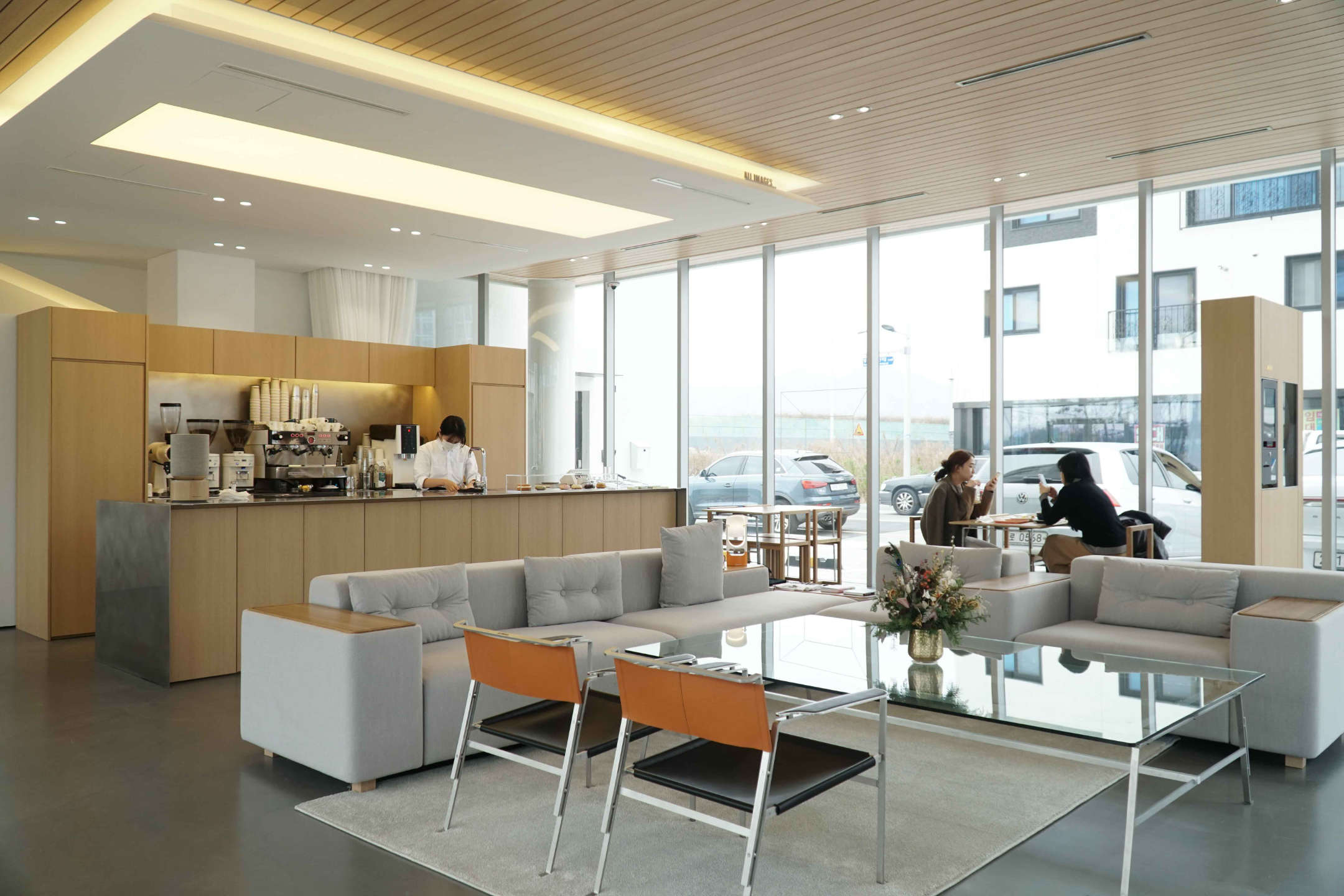
ALL IMAGES
올이미지스는 사진을 전공한 오너가 운영하는, 부산 명지의 주택 1층에 자리한 카페입니다. 가족과 함께할 삶을 위해 지은 집의 일부를 사람들과 나누고자, 그는 이 공간을 누군가의 응접실처럼 편안하게 머물 수 있는 장소로 만들었습니다. 이번 프로젝트는 공간이 완성되기 전, 이미 오너가 보여주고자 하는 이미지들이 먼저 정리되어 있었다는 점이 인상 깊었습니다. 자신의 사진 작업과 함께, 카페에 걸고 싶은 이미지들을 먼저 선별해두었고, 그 방향은 결과적으로 이 공간이 단순한 카페가 아니라 사진가의 정체성과 시선이 담긴 ‘열린 응접실’처럼 느껴지도록 만들었습니다.
서비스센터는 그런 성격을 담아, ‘ALL IMAGES’라는 이름과 함께 브랜드의 아이덴티티를 제안하고 정리했습니다. 이 이름은 단순히 사진이 걸린 공간이라는 의미를 넘어, 사진가의 삶, 기록, 응시, 그리고 이미지로 세상을 바라보는 태도를 함축하고 있습니다. 올이미지스는 카페이기 이전에, 한 사람의 시선이 공간을 이루는 방식에 대한 제안이기도 했습니다. 서비스센터는 그 시선이 머무는 풍경이 공간과 브랜드 속에서 자연스럽게 이어질 수 있도록 작업했습니다.
SERVICES
브랜드 & 아이덴티티Brand & Identity
Client - Sanghyuck Yoon
Creative Direction - Minusfront
Visual Identity Design - Service Center
Layout Planning - Minusfront
Spatial Design - Minusfront
Furniture Design - Minusfront
Interior Construction - Minusfront
Signage Design - Service Center
Photography - Minusfront
브랜드 & 아이덴티티Brand & Identity
︎네이밍 Naming
︎아이덴티티 Identity
︎그래픽 디자인 Graphic Design
︎제품 매니지먼트 Product Management공간 Space & Wayfinding
︎사이니지 Signage
︎방문자 경험 Visitor Experience
Client - Sanghyuck Yoon
Creative Direction - Minusfront
Visual Identity Design - Service Center
Layout Planning - Minusfront
Spatial Design - Minusfront
Furniture Design - Minusfront
Interior Construction - Minusfront
Signage Design - Service Center
Photography - Minusfront
HORANG
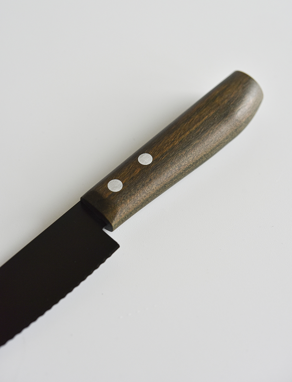
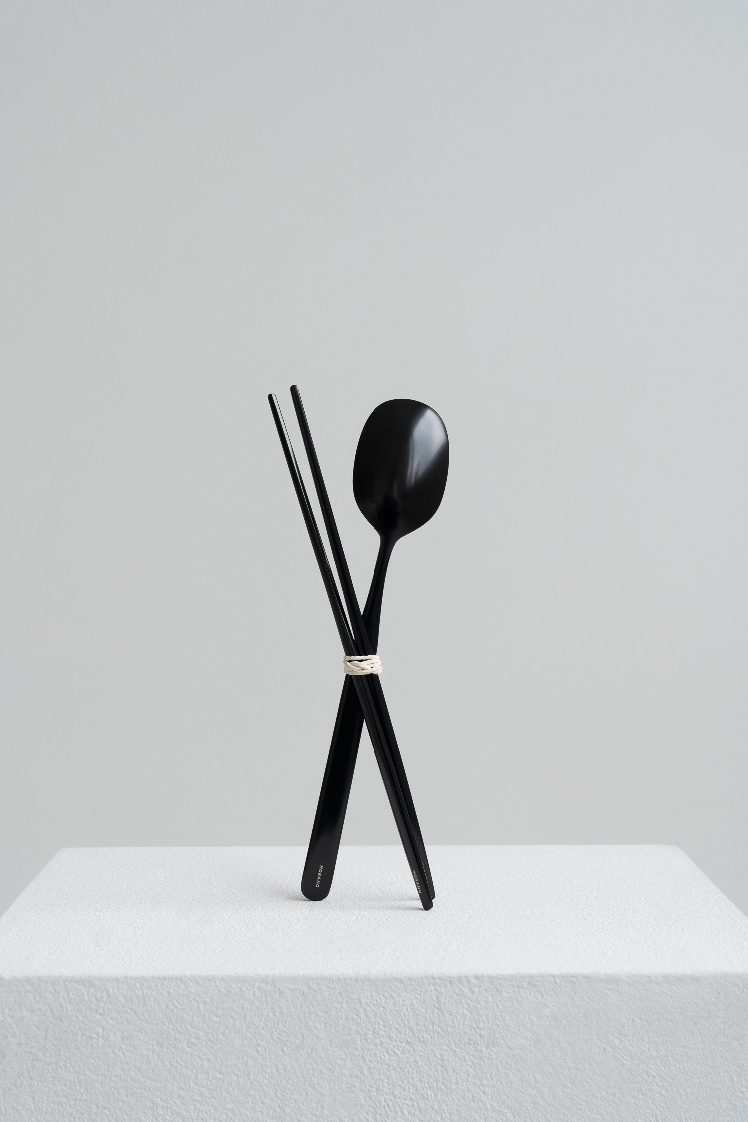
호랑은 주방용품을 중심으로, 오래도록 사랑받을 수 있는 아름다움이 무엇인지 탐구하는 브랜드입니다. 서비스센터는 더호랑의 방향성과 미감을 함께 정리하고, 브랜드의 철학이 일관되게 전달될 수 있는 비주얼 아이덴티티를 구축했습니다. 전반적인 작업은 브랜드 디렉터와의 깊은 교감을 바탕으로 빠르게 진행되었습니다. 배용희 디렉터는 2017년 파운드 오브제(Found Object) 시절부터 인연을 이어온 오랜 파트너로, 공통의 취향과 감각을 공유해온 관계였습니다. 이번 프로젝트 또한 그 오랜 신뢰와 교감 위에서 출발했습니다.
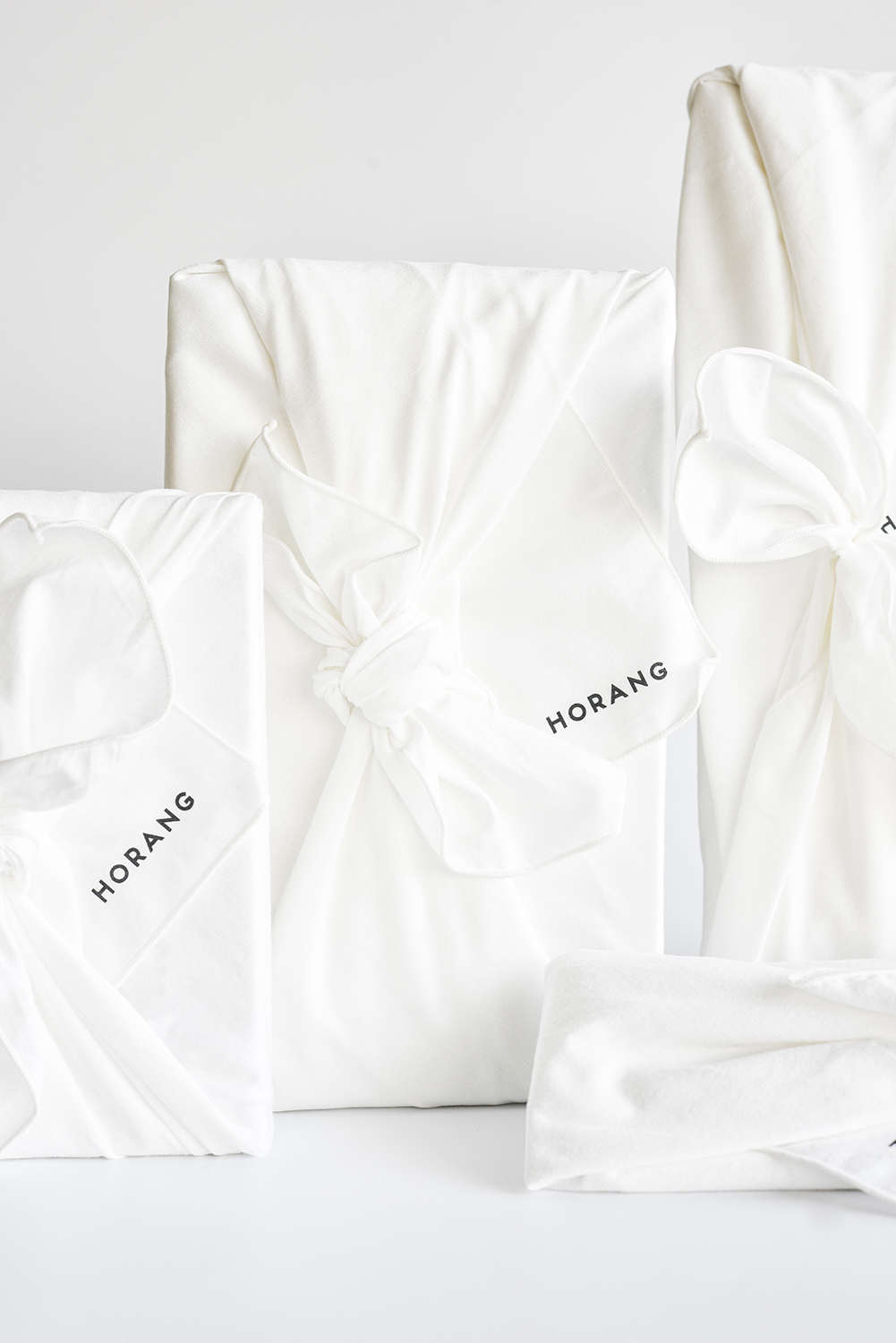
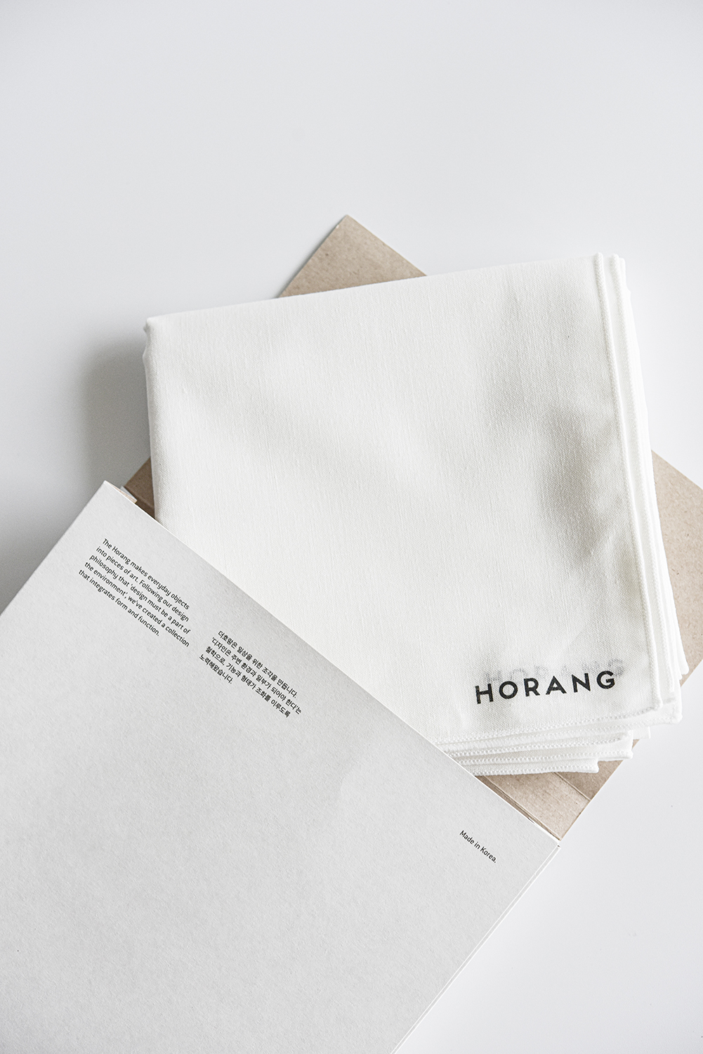
호랑의 대표 컬러는 ‘흰색’입니다. 수많은 디자인 언어 속에서 가장 섬세한 차이를 담아낼 수 있는 색, 그리고 비워낸 자리에 상상력을 채울 수 있는 색으로서 흰색은 이번 프로젝트의 핵심 개념이 되었습니다. 하라 켄야의 책 『백(百)』에 등장하는 문장을 참조하며 “색은 어느틈엔가 쓸데없고 불필요한 요소가 되어 있었다”는 생각에 깊이 공감했습니다. 그 관점 위에서 더호랑의 흰색은 단순한 색이 아니라, 상징, 비움의 미학, 무(無)의 존재감, 그리고 하나의 큰 도화지로 기능하는 디자인 언어가 되었습니다. 우리는 이번 프로젝트에서 호랑의 제품을 ‘일상을 위한 조각’이라는 개념으로 브랜드 문장과 글을 만들었습니다. 하나의 주방용품을 예술작품처럼 오래 바라볼 수 있는 구조를 만들고자 하는 브랜드의 철학이, 시각적으로도 그렇게 전달되길 바랐기 때문입니다.
패키지 디자인 또한 같은 연장선에서 고민했습니다. 자연을 해치지 않는 종이 소재만을 사용해, 브랜드 철학에 맞는 친환경적이면서도 감각적인 결과물을 만들어냈습니다. 종이봉투로 구성된 패키지는 단순하지만 따뜻한 인상을 주며, 문구와 디테일 하나하나에 더호랑의 미감과 태도를 담았습니다. 더호랑은 단순한 주방용품이 아닌, 일상의 물건을 예술처럼 오래도록 바라볼 수 있는 구조를 만들고자 한 브랜드입니다. 서비스센터는 이번 프로젝트를 통해, 그 철학이 일관된 시각 언어로 표현될 수 있도록 함께 고민했습니다.
HORANG is a brand that explores what it means to create beauty that can be loved for a long time—starting with everyday kitchenware. Service Center worked closely with the brand to define its direction and sensibility, building a visual identity that consistently reflects its philosophy. The entire process moved swiftly, grounded in a long-standing relationship with Creative Director Yonghee Bae, who first crossed paths with our team in 2017 through the concept store Found Object. This project, too, grew from years of mutual trust and shared sensibilities.
HORANG’s signature color is white. Among the countless visual languages available, we saw white as the one that carries the subtlest distinctions—and as the color that leaves space for imagination. Inspired by Kenya Hara’s book White, particularly his thought that “color has gradually become an unnecessary element,” we found deep resonance with the idea that white, when used deliberately, can act as a powerful design language. In HORANG’s case, white functions not only as a color, but as a symbol, a space for emptiness, a sense of absence, and a blank canvas. As part of this project, we developed the phrase “sculptures for the everyday” as a conceptual anchor for the brand. It expresses the belief that a single piece of kitchenware can be elevated—seen and appreciated like a work of art over time.
The same philosophy guided the design of HORANG’s packaging. We used only recyclable paper materials, in line with the brand’s commitment to sustainability. The result is a packaging system built from simple paper bags that feel warm and honest. Every detail, from typography to language, was considered carefully to reflect HORANG’s aesthetic and tone. HORANG is not just a kitchenware brand—it aspires to create objects that can be quietly admired, like art, over the course of daily life. Service Center worked to ensure that this philosophy would carry through in every element of the brand’s visual identity.
호랑은 주방용품을 중심으로, 오래도록 사랑받을 수 있는 아름다움이 무엇인지 탐구하는 브랜드입니다. 서비스센터는 더호랑의 방향성과 미감을 함께 정리하고, 브랜드의 철학이 일관되게 전달될 수 있는 비주얼 아이덴티티를 구축했습니다. 전반적인 작업은 브랜드 디렉터와의 깊은 교감을 바탕으로 빠르게 진행되었습니다. 배용희 디렉터는 2017년 파운드 오브제(Found Object) 시절부터 인연을 이어온 오랜 파트너로, 공통의 취향과 감각을 공유해온 관계였습니다. 이번 프로젝트 또한 그 오랜 신뢰와 교감 위에서 출발했습니다.
호랑의 대표 컬러는 ‘흰색’입니다. 수많은 디자인 언어 속에서 가장 섬세한 차이를 담아낼 수 있는 색, 그리고 비워낸 자리에 상상력을 채울 수 있는 색으로서 흰색은 이번 프로젝트의 핵심 개념이 되었습니다. 하라 켄야의 책 『백(百)』에 등장하는 문장을 참조하며 “색은 어느틈엔가 쓸데없고 불필요한 요소가 되어 있었다”는 생각에 깊이 공감했습니다. 그 관점 위에서 더호랑의 흰색은 단순한 색이 아니라, 상징, 비움의 미학, 무(無)의 존재감, 그리고 하나의 큰 도화지로 기능하는 디자인 언어가 되었습니다. 우리는 이번 프로젝트에서 호랑의 제품을 ‘일상을 위한 조각’이라는 개념으로 브랜드 문장과 글을 만들었습니다. 하나의 주방용품을 예술작품처럼 오래 바라볼 수 있는 구조를 만들고자 하는 브랜드의 철학이, 시각적으로도 그렇게 전달되길 바랐기 때문입니다.
패키지 디자인 또한 같은 연장선에서 고민했습니다. 자연을 해치지 않는 종이 소재만을 사용해, 브랜드 철학에 맞는 친환경적이면서도 감각적인 결과물을 만들어냈습니다. 종이봉투로 구성된 패키지는 단순하지만 따뜻한 인상을 주며, 문구와 디테일 하나하나에 더호랑의 미감과 태도를 담았습니다. 더호랑은 단순한 주방용품이 아닌, 일상의 물건을 예술처럼 오래도록 바라볼 수 있는 구조를 만들고자 한 브랜드입니다. 서비스센터는 이번 프로젝트를 통해, 그 철학이 일관된 시각 언어로 표현될 수 있도록 함께 고민했습니다.
HORANG is a brand that explores what it means to create beauty that can be loved for a long time—starting with everyday kitchenware. Service Center worked closely with the brand to define its direction and sensibility, building a visual identity that consistently reflects its philosophy. The entire process moved swiftly, grounded in a long-standing relationship with Creative Director Yonghee Bae, who first crossed paths with our team in 2017 through the concept store Found Object. This project, too, grew from years of mutual trust and shared sensibilities.
HORANG’s signature color is white. Among the countless visual languages available, we saw white as the one that carries the subtlest distinctions—and as the color that leaves space for imagination. Inspired by Kenya Hara’s book White, particularly his thought that “color has gradually become an unnecessary element,” we found deep resonance with the idea that white, when used deliberately, can act as a powerful design language. In HORANG’s case, white functions not only as a color, but as a symbol, a space for emptiness, a sense of absence, and a blank canvas. As part of this project, we developed the phrase “sculptures for the everyday” as a conceptual anchor for the brand. It expresses the belief that a single piece of kitchenware can be elevated—seen and appreciated like a work of art over time.
The same philosophy guided the design of HORANG’s packaging. We used only recyclable paper materials, in line with the brand’s commitment to sustainability. The result is a packaging system built from simple paper bags that feel warm and honest. Every detail, from typography to language, was considered carefully to reflect HORANG’s aesthetic and tone. HORANG is not just a kitchenware brand—it aspires to create objects that can be quietly admired, like art, over the course of daily life. Service Center worked to ensure that this philosophy would carry through in every element of the brand’s visual identity.
SERVICES
브랜드 & 아이덴티티Brand & Identity
Client - Yonghee Bae
Branding Development - Service Center
Visual Identity Design - Service Center
Brand Text - Service Center
Package Design - Service Center
Package Making - KIO
Photography - HORANG
브랜드 & 아이덴티티Brand & Identity
︎아트디렉션 Art Direction
︎아이덴티티 Identity
︎그래픽 디자인 Graphic Design
︎패키지 Package
︎브랜드텍스트 Texts for Brand
Client - Yonghee Bae
Branding Development - Service Center
Visual Identity Design - Service Center
Brand Text - Service Center
Package Design - Service Center
Package Making - KIO
Photography - HORANG
LINKS
[Interview] ‘공간에 스며든 소리의 미학: ‘호랑' 배용희 대표와 KEF의 인터뷰’, KEF, 2025
[Magazine] ‘수저가 건네는 이야기’, 마리끌레르, 2025[News] DFA 어워드 수상, 2024
︎ ︎ ︎
[Interview] ‘공간에 스며든 소리의 미학: ‘호랑' 배용희 대표와 KEF의 인터뷰’, KEF, 2025
[Magazine] ‘수저가 건네는 이야기’, 마리끌레르, 2025[News] DFA 어워드 수상, 2024
︎ ︎ ︎

COSMO40
코스모40은 쇠퇴한 채 방치된 거점 공간에서 주민 참여와 지역 재생이라는 의미를 담아 탄생한 공간입니다. 이후 모든 것에 경계 없이 열려있는 코스모40은 고유의 영감을 내재한 공간이 되었습니다. 하나로 합쳐진 과거와 동시대 건축은 시각적 긴장감을 유발하며 새로운 관점과 낯선 시각으로 공간을 탐구하게 합니다. 공간 곳곳에 위치한 빛과 기둥은 전체를 아우르는 건축적 요소로 다양한 문화 예술적 시도를 더욱 극대화해주는 장치로 제공됩니다. 그리고 코스모40이 위치한 가좌동은 인천의 문화적 양분을 키우고 지역 사회와의 연대를 위해 다양한 예술가와 창작가들이 모여있습니다.
Cosmo40 was born from a once-abandoned industrial site, reimagined through the lens of community engagement and urban regeneration. Since its inception, Cosmo40 has remained open to all boundaries—becoming a space imbued with its own unique inspiration. The fusion of past and contemporary architecture creates a visual tension that invites visitors to explore the space with fresh perspectives and unfamiliar eyes. Light and columns, positioned throughout the building, serve as unifying architectural elements that amplify the impact of various cultural and artistic experiments held within. Located in Gajwa-dong, Cosmo40 sits at the heart of Incheon’s evolving cultural landscape, where artists and creators gather to foster both artistic expression and solidarity with the local community.
— from Cosmo40
SERVICES
브랜드 & 아이덴티티Brand & Identity
Client - COSMO40
Branding Development - Service Center
Visual Identity Design - Service Center
브랜드 & 아이덴티티Brand & Identity
︎전략 Strategy
︎아이덴티티 Identity
︎사진 Photography
︎아트디렉션 Art Direction
︎캠페인 Campaigns
︎브랜드 텍스트 Texts for Branding
︎제품 매니지먼트 Product Management
︎웹사이트 디자인 Web Design공간 Space & Wayfinding
︎동선 설계 Wayfinding Strategy
︎사이니지 Signage
︎공간 스타일링 Visual Merchandising
︎방문자 경험 Visitor Experience
Client - COSMO40
Branding Development - Service Center
Visual Identity Design - Service Center
